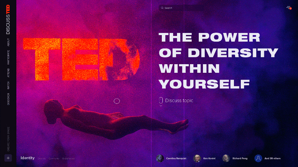
This is a personal project intended to bring new experience to the TED web platform.

I love TED; it’s a great stage for meaningful talks. However, there are problems when it comes to the topic discussion. Certainly, ted.com has a comments section on every talk page. But there are no tools for real user-to-user interaction.

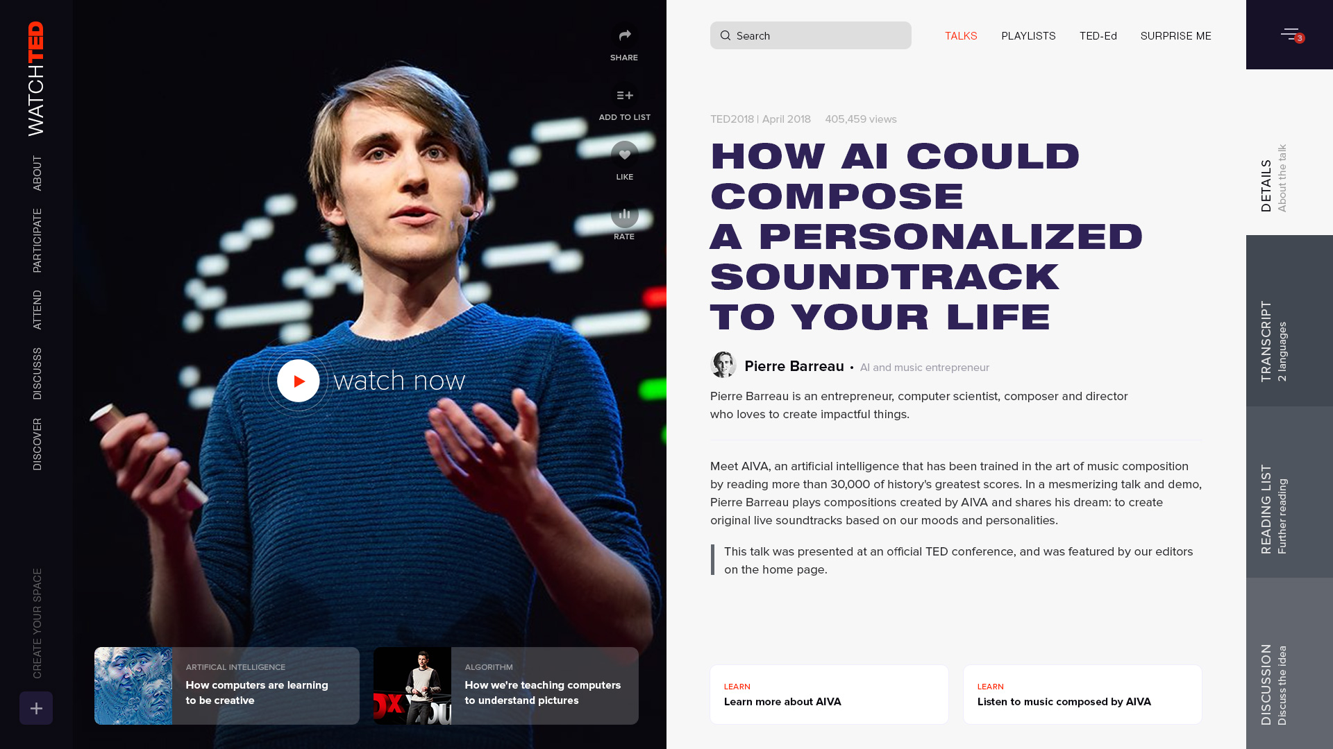
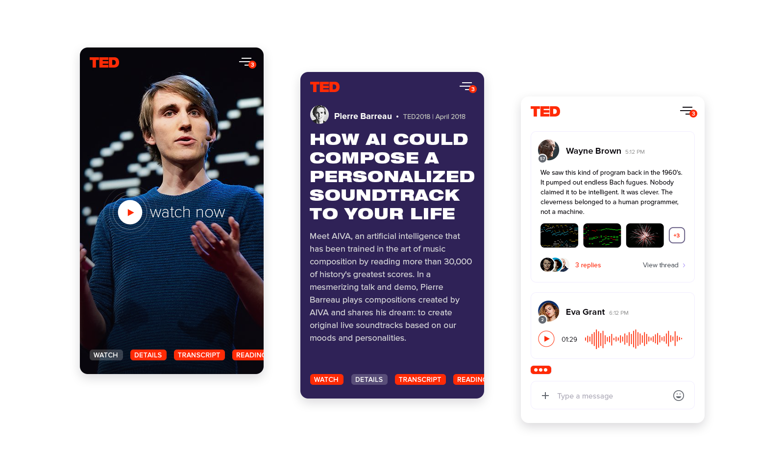
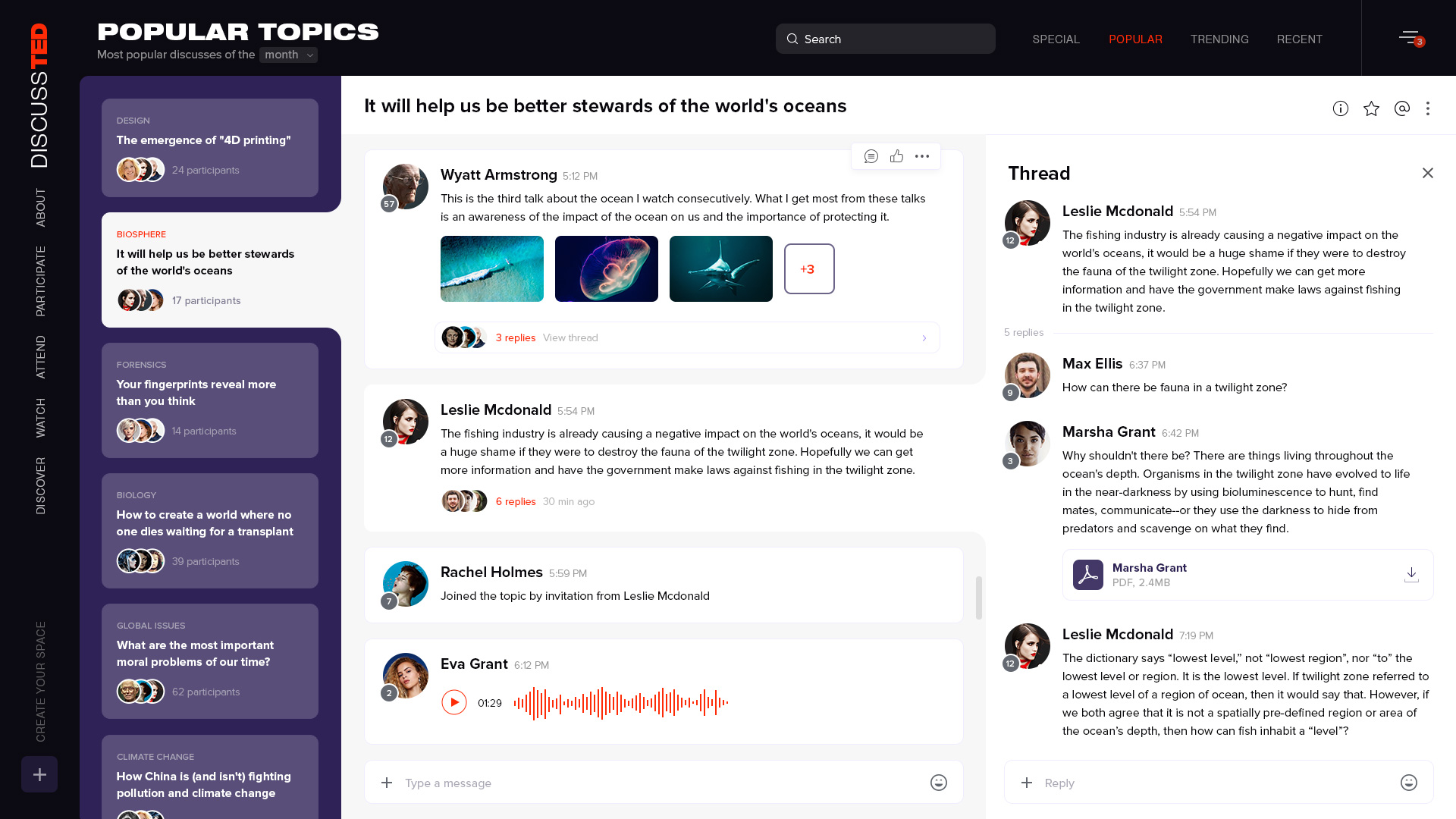
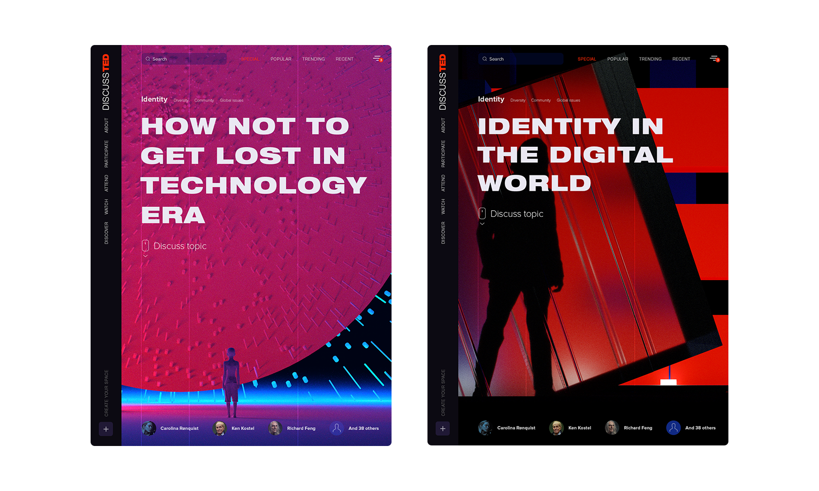
You can post a comment under a video, but it is literally like talking with the wall. Someone can reply to your comments, but it leads nowhere because you can’t even continue the discussion with a person (there is no such thing as private messages). Obviously, there is no way to invite someone to the conversation or to explore the most important discussions and join them. Moreover, TED.com entices you to consume more content instead of taking a breath, thinking about the topic and discussing it with other thinkers. I believe TED.com users deserve a much better experience. And if we are going to enhance the one aspect, why not to rethink the whole experience?

Hope you will find my journey interesting. Let’s begin.

Role & Services

Art direction
UI/UX design
Concept
Motion

The talk page

First of all, I approached the heart of TED.com — the talk page. That’s the place where you can gain thoughts from the most prominent thinkers from around the globe. The reason for the new layout is to allow the user to perform different actions while watching a video. For example, you can easily watch a video and see the whole transcript (which is extremely inconvenient on the current website). Moreover, you can quickly check out materials mentioned in a video or recommended for further topic exploration.

The right-side navigation bar provides flexibliity. Users can easily switch between the details, transcript, reading list and the discussion screens. The last one provides new communication opportunities for the audience. It’s still easy to leave a comment, but now you can do much more: you can start a new thread and send a private message and attach different assets (such as photo, video and audio files). Moreover, one talk can be linked to multiple discussions. It allows you to see how much a particular speech resonated with the audience. Each discussion will be displayed in the appropriate website section. So you finally can explore not just videos, but discussion itself.

Mobile version

Mobile version redesigned as well to provide a better experience and maintain the new functionality. It retains the core aspects while omitting insignificant information. Thus you always have access to the full-fledged TED platform in your pocket.

Discussions page

As I mentioned earlier, discussions got their own space which divides into 4 sections: Special, Popular, Trending and Recent. So there is a grade by discussions importance. All newest ones go to the Recent section. Then, if the topic grows (got more posts, threads and votes, etc.) it goes to the trending section. And the last one is the Popular section. There you will find the most valuable discussions.

There is also Special topics section. It’s a unique place with topics set by the website supervisors. Such discussions have their own interactive cover, illustrating the topic to convey message and bring them some personality. Of course, user can choose to skip the cover next time.

I created a series of 3D illustrations for this section.

New discover experience

Free exploration is a new way to search videos on TED.com. That’s a field with floating elements inside. All the items are grouped by the topic. You can move on the field by dragging your mouse cursor. So you are travelling in space with no strict borders between topics. It’s kind of a visual playful way to find interesting things.

Cradle app

Twigs app

Coursera redesign

Zaha Hadid Architects