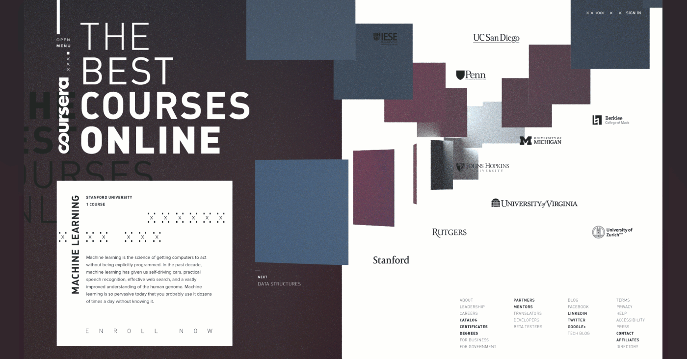
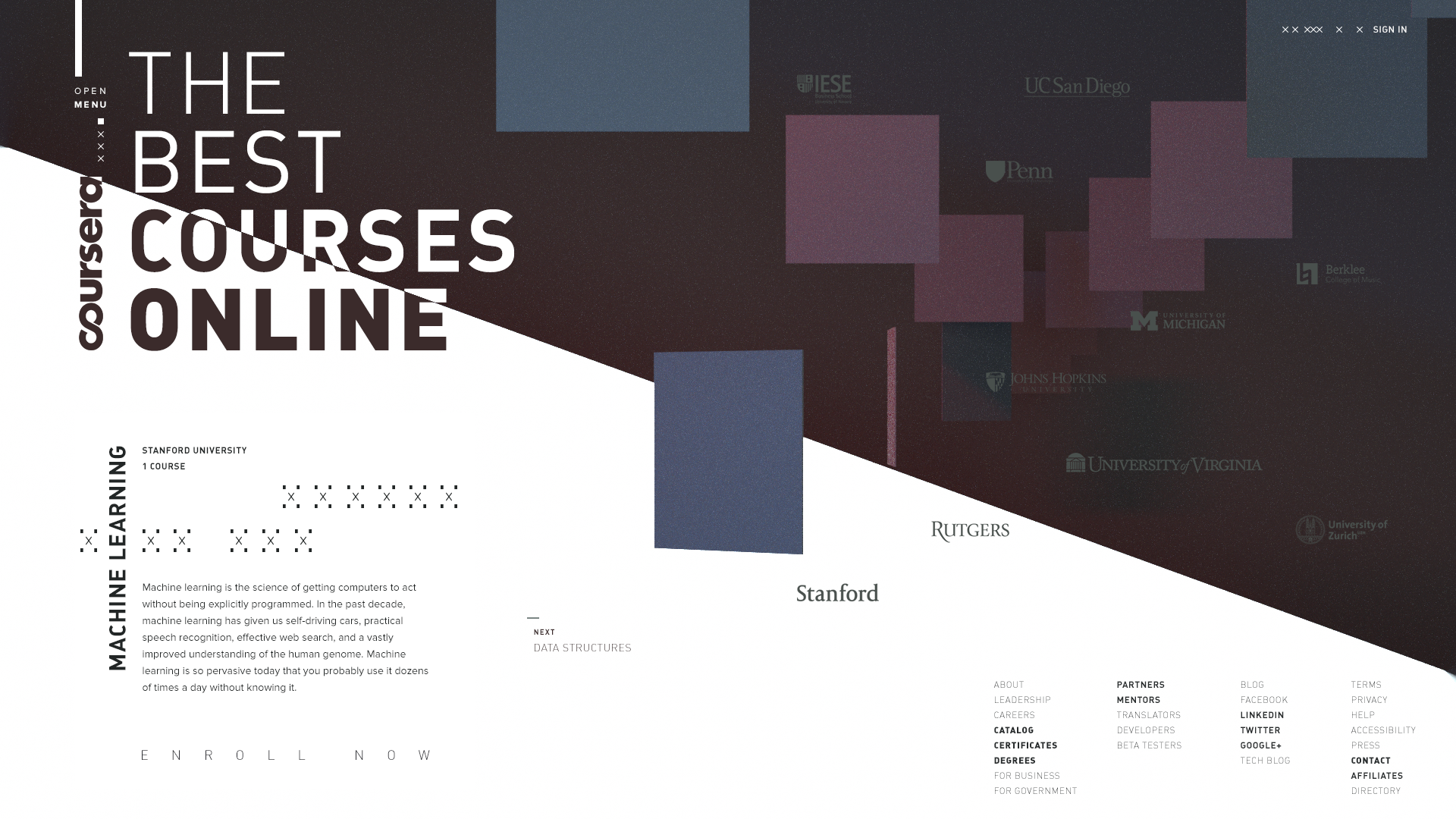
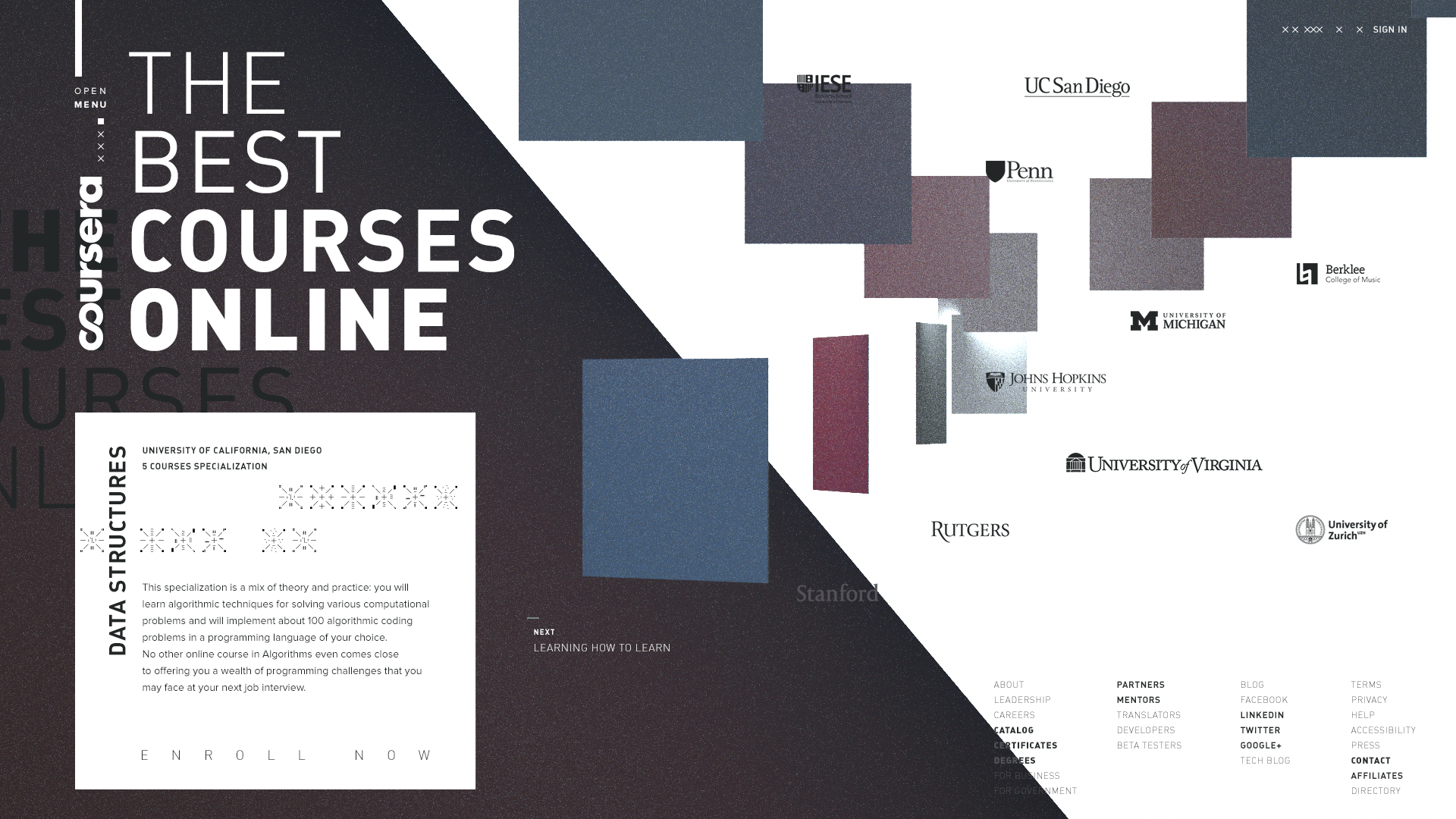
The project is directed to rethink the brand of Coursera, a popular online education platform.
Each way of life is paved with a unique combination of knowledge and skills. It’s the thing that makes us who we are. The myriad different pieces of knowledge are scattered in the modern informational world. Some of them are true brilliants when others just useless noise. How can you decide which ones are worth your attention?
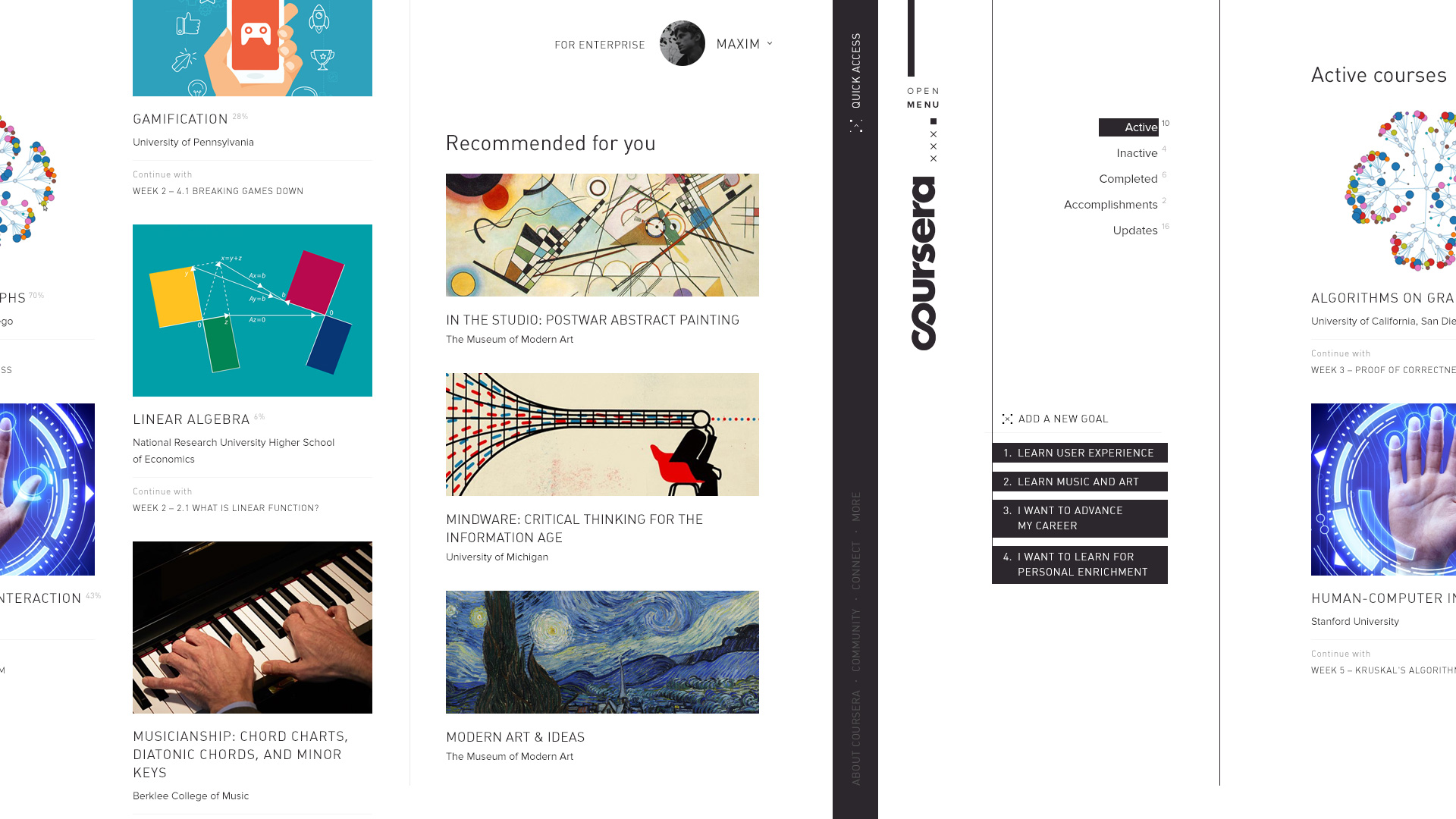
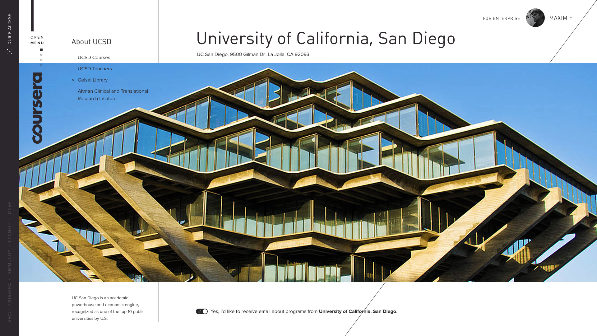
It has become harder and harder to see the whole picture and find your own learning path. Moreover, it’s always challenging just to keep on track. So it would be really useful to have a guide which shows you all of the opportunities and helps you to carry on your way. A guide, which selects the best information in every field. Coursera is becoming such a guide. It shows us thousands of paths in one place and gives a map for each one.


